Transform Your Dashboards Now: Exclusive Glow Up Services That Build Trust and Drive Action

viz glow up Mar 13, 2025
Before and after comparison of Citi Bike usage data visualisation transformation by Dub Dub Data, highlighting improved clarity, design, and impact.


Elevate Your Data Visualisations to Unlock Business Impact and User Adoption

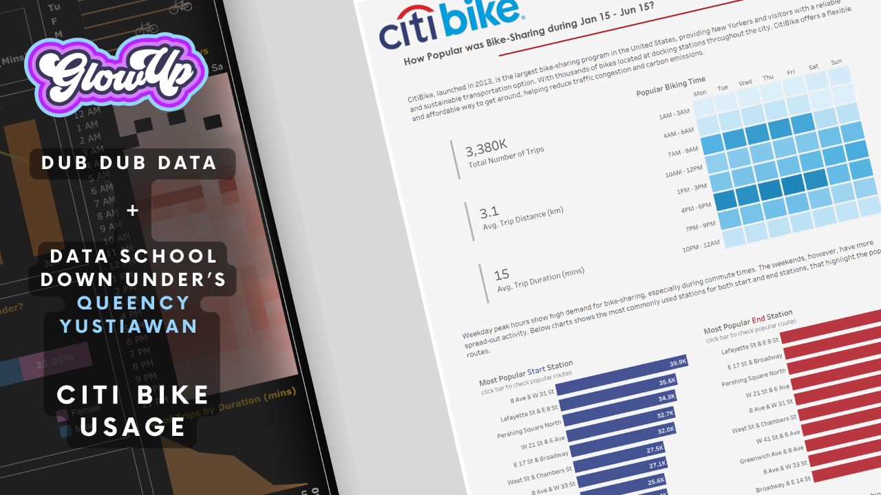
At Dub Dub Data, we help businesses transform underperforming dashboards into high-impact data visualisations that build trust, enhance decision-making, and increase user adoption. If your dashboards feel cluttered, confusing, or you’ve noticed your stakeholders aren’t engaging with the insights - you’re not alone.

What you might be missing is the visual clarity and intuitive storytelling that converts complex data into actionable intelligence.  This is where our Glow Up methodology comes in.

Imagine your stakeholders saying:

"I get it… this makes total sense."

That’s the power of a Glow Up - a step-by-step data visualisation redesign service that strips away the noise and makes your data impossible to ignore.


What Is a Glow Up and Why Does It Matter?

A Viz Glow Up is a transformative process that takes your existing dashboards or reports and turns them into engaging, easy-to-use decision-making tools.

It’s not just a visual facelift. We design for clarity, trust, and impact - helping your teams quickly understand the story your data tells.

At Dub Dub Data, we offer two Glow Up solutions:

  • Actionable feedback, providing you with a clear, actionable checklist to improve your dashboards internally.
  • Full-service dashboard redesign, where we handle everything and deliver a polished, user-friendly dashboard aligned to your business goals.

Either way, the outcome is the same: better dashboards, better decisions, and better outcomes.


Why Your Business Needs a Data Visualisation Glow Up (Now)

Here’s why our clients call it a game-changer:

✅ Clarity Drives Action

When insights are clear, action follows. If your team struggles to interpret the data, they hesitate. Our Glow Ups deliver instant clarity, helping your users feel confident in their decisions.

✅ Trust is Built Through Great Design

We use consistent branding, colours, and fonts to establish credibility. When your dashboards look trustworthy, they are trustworthy in the eyes of your stakeholders.

✅ Adoption Increases When Design Reduces Effort

No one wants to use dashboards that are confusing or visually overwhelming. A Glow Up simplifies the experience, creating a seamless journey from data discovery to decision.

✅ Bridge the Gap Between Tech Teams and Business Leaders

We help you translate technical dashboards into business-ready tools, ensuring that even non-technical users can extract value without friction.


See It in Action: The Citi Bike Dashboard Glow Up

We recently partnered with Queency Yustiawan from The Data School on a real-world Glow Up of an old Tableau Viz of the Day by Pankil Shah, showcasing Citi Bike Usage in NYC.

Dub Dub Data Original Tableau Citi Bike Dashboard Before Glow Up Click to view original, Citi Bike Usage by Pankil Shah..

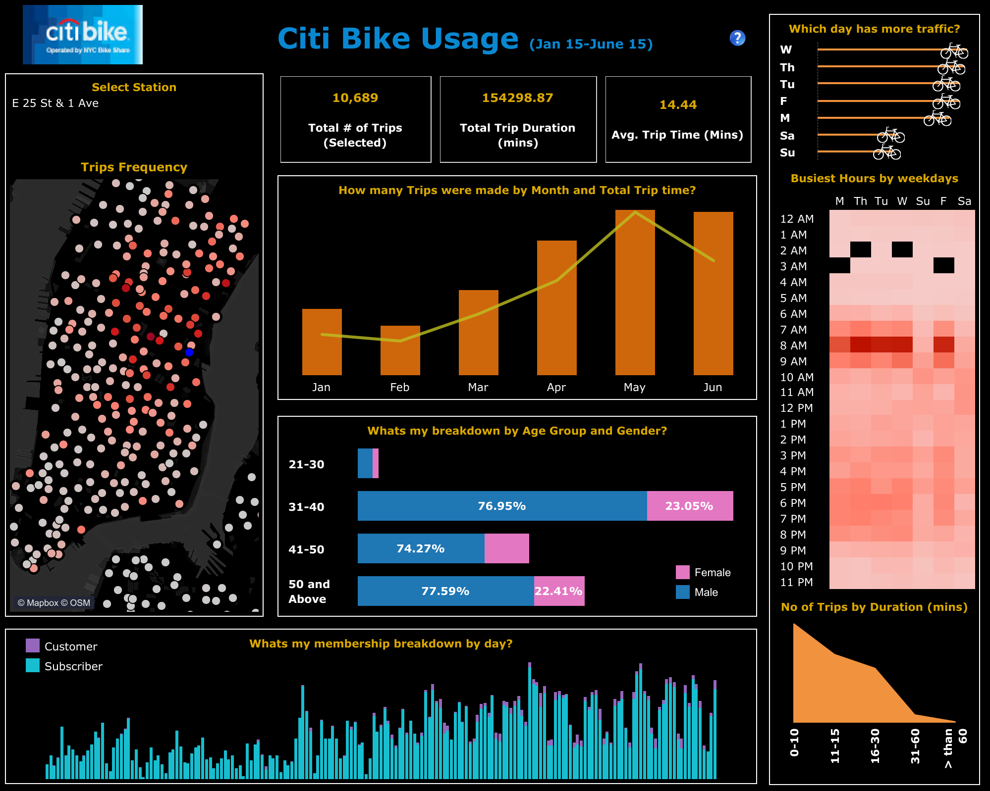
The original visualisation had valuable data - but its design made it hard to engage with:
❌ Heavy black background with bright white borders - harsh on the eyes.
❌ No clear focal point - users didn’t know where to start.
❌ Confusing combo charts - bars and lines with unclear relationships.
❌ Tiny fonts on key metrics (BANs) - making important numbers easy to miss.
❌ Too many decimal places - clutter that didn’t add value.
❌ Inconsistent spacing and alignment - eroding trust.
❌ Inaccessible colour choices, including blue/pink gender defaults.
❌ Clunky maps with 300+ dots - overwhelming instead of insightful.
❌ Unclear terminology - customers vs. members vs. subscribers? Huh?


After the Glow Up

Dub Dub Data Original Tableau Citi Bike Dashboard After Glow Up

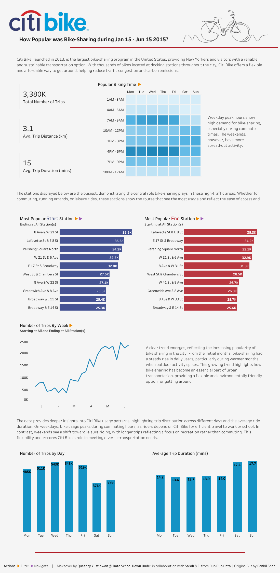
We did a few things differently, in our Citi Bike Usage Tableau Glow Up and you can too: 

✅ Eyecatching design with great header
✅ Clean, on-brand, accessible colour palette.
✅ Clear storytelling flow - no more "Where do I start?"
✅ Big As* Numbers (BANs) that pop.
✅ Interactive Toblerone icons indicating actions (orange = filter, purple = navigate).
✅ Focused maps on top 10 routes - not 300+ dots of noise.
✅ Smart tooltips: simple sentences, bold key data.
✅ Dynamic titles that keep users on track.
✅ Consistent padding, spacing, and alignment that balances the dashboard.
✅ Use of typography hierarchy, fonts are thoughtful and add to ease of navigation


What We Learned From Our Data School Collaboration

Working with Queency and The Data School Down Under reinforced something we already knew: clarity and consistency are king. This collaboration allowed us to coach emerging data talent on our methodology while delivering a polished, user-focused dashboard.

You can read more about our free data visualisation consulting with The Data School here.


Why Our Glow Ups Work

✅ We design for speed to understanding - so your brain doesn’t need to work overtime.
✅ We create intuitive navigation that guides users (without them realising it).
✅ We trigger positive engagement loops, encouraging people to come back for more insights.
✅ We build visual hierarchies that establish trust and authority, subtly influencing how people prioritise and act on information.


The Glow Up Difference

A Glow Up isn’t just a redesign, it’s a conversion tool for your dashboards. Attention is the #1 asset:
✨ Make insights easier to understand
✨ Boost confidence and trust in your data
✨ Encourage consistent usage and action


Why Leaders Are Prioritising Glow Ups Now

  • Speed to Insight = Competitive Advantage
  • Trust in Data = Confident Decision-Making
  • Better UX = More Engagement + ROI

If you wait, your competition won’t. And if you’re not upgrading your dashboards, you’re leaving opportunity on the table.


👉 Ready to discuss a Glow Up for your organisation?

We work with a limited number of clients to ensure high quality and impact. Book a free info session now to find out more about Glow Ups for your organisation before we fill our last spots for this quarter.


Glow Up Your Wardrobe, Too!

Proud data nerd? Show it. Our Dub Dub Data merch - T-shirts, hoodies, and more - are perfect for your next dashboard reveal (or data meetup).
🛍️ Shop the Glow Up Collection


Catch the Glow Up on our Podcast


Summary

In this episode of Undubbed, hosts Fiona Gordon and Sarah Burnett introduce their new podcast series, Viz Glow Ups, where they explore the transformation of poorly designed data visualisations into more effective and aesthetically pleasing versions. They discuss the importance of Glow Ups in enhancing clarity, trust, and user adoption, and share their methodology for approaching these transformations.

The episode features a live breakdown of an original visualisation and its Glow Up, highlighting the design principles and insights gained throughout the process and is best viewed on a video channel.


Takeaways

  • Glow Ups enhance clarity by reducing cognitive load.
  • Good design fosters trust and credibility in data.
  • Standardisation in design aids user adoption.
  • Collaboration with the Data School provided valuable insights.
  • Visual storytelling is crucial for effective data communication.
  • Dynamic titles improve user understanding of visualisations.
  • Colour choices can significantly impact user experience.
  • Consistent design elements enhance overall comprehension.
  • Feedback and iteration are essential in the design process.
  • Advancements in design tools have improved visualisation quality.


Links to Citi Bike Usage Workbooks

Original Viz by Pankil Shah

Initial Glow-Up by Queency collaboration with Dub Dub Data

Final Glow-Up by Dub Dub Data


Chapters

00:00 - Introduction to Viz Glow Ups
01:17 - Understanding Glow Ups in Data Visualisation
02:04 - Importance of Glow Ups
04:49 - Approaching Glow Ups: Methodology and Strategies
06:00 - Collaboration with the Data School
06:19 - Live Glow Up Breakdown: Analysing a Visualisation
17:55 - Analysing Bike Demand and Supply Dynamics
22:14 - Visual Design Consistency and Clarity
24:01 - Effective Use of Typography and Layout
25:18 - Storytelling Through Data Visualisation
29:46 - Interactive Elements and User Engagement
39:31 - Comparative Analysis of Visualisations
41:38 - Reflections on Design Evolution and Future Trends


Transcript 

Fi (00:09)
Welcome to Undubbed, where we're unscripted, uncensored, and undeniably data. I'm Fiona Gordon.

Sarah (00:17)
And I'm Sarah Burnett.

Fi (00:20)
And today we're launching a new podcast series, Viz Glow Ups. We'll be revisiting and uplifting old Tableau Viz of the Day examples to show how great design can significantly improve comprehension and adoption.

Sarah (00:38)
In this episode, we'll break down why Glow-ups matter, how we can approach them at Dub Dub Data and how they help bridge the gap between tech and business. We'll also be sharing insights from our recent collab with the data school, where we put our Glow-up methodology to the test.

Fi (01:00)
And for those listening on audio, we'll be talking through visuals. So check the show notes for links to the before and after comparisons, or feel free to join us on one of our video podcast channels like Spotify or YouTube.

Sarah (01:16)
Let's get into it.

Fi (01:17)
Okay Sarah, so what is a Glow up in the data viz world?

Sarah (01:20)
So Fi, a Glow up for us is when we take a poorly designed or not so flashy looking viz and we Glow it up and turn it into something beautiful that is easily read by its users.

Now, Fi and I have done this in the past for a lot of clients. But for here, for this podcast series, we're actually taking old Tableau viz of the days, and we're going to come in and improve the clarity, trust, and adoption. in BAU, we help our clients either with notes or hands-on fixes. Our philosophy for this series

We're not here to critique, we're here to elevate. So it's about making insights accessible and not tearing down past work.

So Fi, why are Glow Ups important?

Fi (02:03)
Well, Glow Ups help

provide clarity over complexity. And what I mean by that is they remove unnecessary noise in a visualization or dashboard to allow the insights to shine. Now we really want to pull things out of the dashboards to make it super easy. In fact, my benchmark for this is when people take a look at a visualization and they go, I knew that, and insert X, Y, Z.

That really means that you've taken away a lot of cognitive load and helped those insights to shine. Another reason why Glow Ups are important is that it improves trust. So trust through design. A well-balanced viz increases credibility. And in terms of rhetoric, establishing credibility is really important. making sure that you are able to

help people to look at the data and trust that it's accurate. Another thing that helps Glow Ups in terms of their importance is standardization and branding. Now that's going to be interesting in terms of our Viz of the Day Glow Ups because each visualization is for a different reason, perhaps different company, different topics But certainly when we're talking about Glow Ups in the

business world or out in the wild for the Glow Ups that we do, standardization and branding really also helps to build that trust as well. also reduces some of the effort for people So cohesion and visuals really reduces that cognitive load as well. Glow Ups also help with driving adoption.

So no one wants to buy off a shitty website that looks like it's spammy, it's got all the ads flashing it's got lots of colors and it's screaming at you. It's really difficult to feel like, hey, I want to sit here and look at something that looks awful. So good design and Glow Ups means that stakeholders will actually come back and use the insights that you're creating through your work.

And finally, Glow Ups are important because it actually helps to bridge the gap between the technical developers and what the business actually requires those are things that I believe, really make Glow Ups important

Sarah (04:33)
Yeah, and I think it's really important that whole bridging the gap between tech and business because we've all seen dashboards that have been really well designed, but from a technical standpoint, and they fall flat when the business gets to see them. So excited to get this underway.

Fi (04:49)
Great stuff. Well, let's take

a look at how we at Dub Dub approach a Glow Up. what are the things that occur for a Glow Up with a client or indeed for Viz of the Days?

Sarah (05:01)
Yeah, so first of all, we review the existing visualizations and we look at key areas for improvement. Now this can be some of the key things that Fi spoke about. So whether it's overloaded with color, whether it's got like just too much going on, on the page, all these things that we'll get into to build trust and credibility. After that, we then look at like providing structured feedback.

So think of these as cliff notes for clients who want to implement the changes themselves. that's one of the methods that we offer. So basically it's a viz. We'll look at glowing up and give some cliff notes and pass that back.

Fi (05:36)
Definitely a cheaper

Sarah (05:39)
The other part we come in and we actually do the full viz Glow Ups. Now this is where we make changes and hand back the final workbook. this is dependent on what data we can obviously get access to, but we do all that heavy lifting and shifting. And of course, we always come back and present what we've done and how we've done it.

by ensuring that the design is easy and actionable to use, we see a real uplift in the adoption and that's really good for everybody involved. those are some of the key things that we see really important when it comes to the Glow Ups.

Fi (06:12)
Thanks for that.

Sarah (06:13)
So Fi, I want to talk a little bit about a collaboration week that we had a couple of months ago.

Fi (06:16)
Mm-hmm. I think you're referring to the data school

Sarah (06:19)
data school. Do you want to talk a little bit about that?

Fi (06:19)
Sure. For those of you that don't know the data

school, the data school is actually a business that brings cohorts of people in to teach them about Tableau Power BI, Alteryx for four months. And that includes doing training as well as specific client weeks where they get problems to solve. Our purpose of doing a collaboration between the data school and Dub Dub

was that in the future, we would like to be collaborating and bringing data schoolers onto some of the work that we're doing to provide a more economical opportunity for our clients as well. We started out by teaching them on our viz guidelines and then gave them a few projects, a few project vizs to really test their design skills

Primarily, they were working on one Viz of a day for the week, as well as still continuing with some of their training that was delivered by their data school coach. So it wasn't even a full week's worth of work. Throughout the week, you and I went in and did some coaching for individuals. So one-to-one coaching.

to help them to understand how to better approach some of the design Let me tell you, we're talking about old Tableau visualizations, not the ones that you might see today, which are much more refined in the design. we're really helping the data school trainees understanding different aspects of great design, understanding how to receive feedback.

how to apply that feedback. And then on the Friday, they did their final presentations where they got real-time feedback from the both of us. The key takeaways that I had from our experience was that there were strengths in different areas people have. some people are really good at data engineering, and then some people are really good at data visualization. So the people that were really good at engineering,

This probably isn't the week for them and they found it a lot trickier, although they pushed through it. The other things that I thought were really important were around the common challenges and communicating those common challenges and data visualization and design. And like always, it came back really important to have iteration and feedback and developing a great viz.

whilst we gave them the opportunity to WhatsApp us along the way, one thing that I noticed is that we had to lean into that a little bit more, which totally makes sense. I mean, they're just starting out in their careers for the most part.

Sarah (08:53)
Yeah, and something else that I found really interesting was just around the feedback. there was a couple, like you said, that reached out and asked for feedback additional to the allocated times. And there was some that took on a lot of the feedback and there was feedback from two different people, right? So I was giving feedback, you were giving feedback, and sometimes that didn't always align. another important thing is when we gave the feedback, we said it was

subjective, it was up to them what they chose to take or not take away from that feedback. So it really put it in a semi real world situation where you've got multiple stakeholders, multiple feedbacks, and you're kind of trying to do what you think is best for the visualization.

Fi (09:32)
Great points. All right, so I

think we've done enough talking about theoretically, what is what are is Glow Ups. I just have to point out the wonderful t shirts that we're wearing the merch behind it. I think this would be great for anyone that's doing a Glow up on themselves So head over to our website, dub dub data.com head into the store and find these t shirts and there's some hoodies as well.

Alright, so let's get into it the live Glow up breakdown

So here we have it, the original Viz by Pankil Shah. It's Citi Bike Usage in 2015.

So Sarah, what's the first thing that you think of when you see this visualization?

Sarah (10:16)
I see a lot of different colors and I see a lot of borders that are misaligned and I see that kind of dark vibe. yeah, those are the first things that hit me.

Fi (10:25)
Yeah, I agree. So the first

things that hit me is the black background is quite strong, especially when I'm looking at all of the white edges around it. And it's not for me helping me allow things to pop too much off the page.

I feel a bit overwhelmed.

Sarah (10:50)
I also don't know where to look. Like where do I start? There doesn't seem to be much of a flow. I can see the select station in the top left, which is predominantly where the most important thing should sit. If you think about a viz and how you typically read in almost a Z shape and Fi there is going in and just changing those to see if it actually impacts the whole dashboard or not. Cause it's not very obvious what the impact is.

Fi (11:19)
So it does look like when I change the station, everything changes.

Sarah (11:23)
Okay.

a nice way to showcase that would be to update and have a dynamic title because as you're coming into the viz, that Citi Bike Usage between those two dates is a little incorrect because it's actually looking at a very particular station.

Fi (11:39)
spot on.

Is there anywhere that you would know in New York that we can select as like an example?

Sarah (11:47)
like Washington Square.

Yeah, Washington Square, there we go.

Fi (11:56)
Okay, what else sticks out to you?

Sarah (12:00)
we have got some kind of BANs across the top and we've got three of them. I wouldn't call them big as numbers though, would you?

Fi (12:05)
No, not at all.

Sarah (12:08)
And then just the clarity on those BANs. So total number of trips selected. is that trips taken from Washington Square? I can guess so.

Fi (12:20)
Hmm. Would

have to explore more.

Sarah (12:24)
related to that BAN we're looking down now at how many trips were made by month and total trip time. I'm not a big fan of a mixed chart.

Fi (12:34)
interesting. Tell us more.

Sarah (12:41)
Well, in this example particularly, I don't know just by looking at it what the size equates to. what is the bar? Is that the number of trips or the total trip time? I'm not so sure. No. And even when you hover over, it's not very clear either.

Fi (12:57)
not sitting at all.

Right.

Sarah (13:08)
which are the trips and which are the minutes.

Fi (13:08)
Right, I agree. And often what

could help in there is either a little legend or using the legend in title and coloring relative. The other thing that I notice and probably going down into the weeds for a moment,

Sarah (13:23)
Yeah, I agree.

Fi (13:26)
as I hover over in the tooltips as I look up here, is this use of two decimal places, and I'm a, I'm a big proponent of cutting out all decimal places. if you have to have any, just one. it's just superfluous do I need to know that 0.89 % would

24 % not be good enough in this bar here. I think it would, every single extra piece of ink on the page that we're adding is Increasing the amount of thinking time and processing that needs to go on. if you think of your brain like a computer processor The more that you load your computer up with at a time You start to hear the fan ticking over hard and the reason for that is that it's consuming a lot of energy to process the information

Same thing happens with your brain as well. the least amount of information that we can put on this page to tell the story. I'm really like perplexed about what is the story There's no story here for me. There's individual stories. it's interesting when I look at age group and gender.

Across the board we see more males want to jump on a Bike than females. This little key here is sticking over some of the bars as I was changing things So reconsidering where that sits. I know you're not always a fan of the blue pink for gender as well, is that right?

Yeah, So I just feel overwhelmed and really not sure what I should be doing. I mean, this is a good call out Wednesday has the most traffic compared to other days along the way. We sort of see spots throughout the day where it's darker, you know, in terms of the weekdays, but it's a little difficult to get information out

Sarah (15:10)
Yeah, that is. it's a little outdated.

Yeah. And I think just coming back to the bar and the line chart as well, another thing that I don't like about mixing mediums like this when you've got two different scales for example, in

Fi (15:36)
Mm.

Sarah (15:47)
June you're seeing that the line is above the bar and in April it's the other way around. Now does that correlation have any meaning? And most of the time I say that it's almost drawing an unnecessary correlation.

Fi (16:00)
Hmm, good point and really difficult without having

I've noticed something down here, customer and subscriber. Any idea what that is?

Sarah (16:04)
Yeah.

I'm going to take a guess that you could subscribe to Citi Bike or you could be a one-off customer, but I'm not sure. Maybe some definition around there would have been better.

Fi (16:17)
Okay.

Yeah, and into the map

how do you feel about maps?

Sarah (16:26)
There's a time and a place for maps and typically I would say no to the map. But in this example, I can clearly see where Washington Square is and I can by color, which I again am assuming the darker red means the more amount of trips. It's not as clear because I think the colors are a little bit muddy on that dark background.

but it does add in this context more value. How do you feel?

Fi (16:52)
Okay.

I agree. can see that the closer the dots are, the higher the frequency. And again, we had to wave over that with the tool tip to really understand. So there's a bit of cognitive load in there.

Sarah (17:11)
Interestingly, when you do hover on the blue dot, this is actually highlighting round trips. So 160 trips were made from the same destination as which they started. And because we can see up the top there, we've actually got over 15,000 trips that have been selected. So all of the other ones are dispersed throughout the city there.

Fi (17:14)
Yes!

Mm.

Mm.

And I think I would really like to know things

like what's the most popular station? where does that popular station go? I like this. I'm always a big fan of the heat maps, even though it is a lot of ink on the page. But here you can see not so much for starting the day, but certainly finishing the day.

Sarah (17:39)
Yeah.

Fi (17:55)
this particular station has a lot of people wanting to grab a Bike and go elsewhere. And that could be quite problematic, for Citi Bike in terms of how do you get the bikes in versus how do you let the bikes go out? thinking of supply and demand coming to the fore.

Sarah (18:13)
interesting. I've also just noticed when you started talking about the days of the week, look at the order of those days of the week there.

Fi (18:19)
that's weird. That seems

problematic.

Sarah (18:24)
Right? And I think the, bar chart. It's just so skinny. It's a line with the gimmicky Bike is also a misordered. just be really careful if you are using days of the week in the weekday order.

Fi (18:37)
Well, for this one, what they've done is

Thursday has the most traffic. So I'm not, not opposed to it being sorted in that order. maybe it needs to be a little bit longer and the text so you don't automatically assume things. But what concerns me is that this order is different.

Sarah (18:55)
Yeah, and there's no I would say.

Fi (18:57)
Yeah, you would either put the most

at the end, or the most at the beginning, if you were going to reorder them, or just have everything from Sunday through to Saturday across the top, but in order of day of week.

Sarah (19:09)
Yeah. Now what's this little area chart down the bottom right hand corner? What's going on there, Fi?

Fi (19:16)
I would not recommend an area chart for this. So it's broken things down into a band there. So 0 to 10 minutes, 11 to 15 minutes. Really strange as well. it's not equal in the values that it goes up. I would expect, as you're starting to bring together all of the different bandings that you would have

Sarah (19:22)
I

Fi (19:42)
equal values coming through because otherwise you're skewing where the data is. Do you agree?

Sarah (19:50)
Mm, yeah, I do. Also, what's your thoughts on reading the labels here?

Fi (19:54)
good point. mean,

tipping my head to the side. And I also noticed that these labels, a little bit picky, also notice that these labels are bolded. These ones are bolded, but these ones aren't bolded. These ones aren't bolded. And these ones are. So it's, one of those things where we've got a lack of consistency, which then you start to sit and question what's happening with the data, like what happened in between.

this point here. Have we got a bunch of data that wasn't collected?

Sarah (20:28)
Yeah, just maybe there was never a Bike there for a very long period of time.

Fi (20:29)
I doubt it, given that we've got things in

Sarah (20:32)
And now, what about the borders? What's your thoughts on borders around information?

Fi (20:43)
not a fan of borders. I don't mind having tiles and a light background to show the differences. But when you do that, there needs to be equal padding and distance occurring. you can see here, it's quite narrow down the left hand side. But then as soon as we come to the right hand side of the map chart here, we can see it's, I would say three times the amount of space.

And even between the stack bar and bar line, it's even a different amount of spacing in here. So that lack of consistency that I'm seeing come through then starts me thinking, I don't know if I trust what's going on in this dashboard.

Sarah (21:26)
I think borders create a lot of extra work for people to make sure that everything is aligned. You and I do go deep into padding using our inner and our outer padding. So we would by default make sure things were aligned, but sometimes alignment and visually aligned can be slightly different things. And I think if you start with something like borders, you're going to cause yourself a lot of extra work.

Fi (21:27)
Mm.

Sarah (21:55)
to make sure that those borders look exactly how they should.

Fi (21:56)
Agree.

So it's not always a no, but there's a preference from both of us as well. How do you feel about info icons or questions like this? Question icons.

Sarah (22:14)
I like the idea of having an icon there, whether or not that's the right icon. I don't feel it is, and is it in the right position? Again, I think there's just a little bit of misalignment going on here. I like to see them in the, and say the top right or the bottom right, depending on the importance of them. But I think

Fi (22:14)
Yeah.

Mm.

Sarah (22:38)
They are helpful to give that extra context that you might not necessarily want to put on the visual itself.

Fi (22:43)
True. One thing

I find interesting here coming back to the bottom chart, which is customer and subscriber, in this icon they've mentioned members versus subscribers. it's difficult for me to really try and bring that together without having to go most likely and bounce out to Citi Bike NYC (website).

Sarah (23:07)
I'm not sure. Because we've got customers, subscribers, members. Not sure what's going on there.

Fi (23:08)
Mm.

Okay, I'd have one other thing

that's springing into mind, which is the the titles are centered.

Sarah (23:19)
Yes. What's your thoughts on centered titles?

Fi (23:20)
I recommend

that our clients use left align because we read left to right. And so having to shift and balance across, there's more cognitive load for starters, but there's also just a bit of untidiness that's going on

So I would prefer everything to be left aligned and also the titles to all be in title case.

that big word that I think that will always come through in our Glow up reviews, CONSISTENCY.

Sarah (23:51)
Yeah, I agree. there is a little bit of consistency here. The titles are all in the same color. The axes are all in the same color. Whether or not they're the right colors.

Fi (24:00)
Some of the

axes are missing to me.

Sarah (24:03)
Okay, so Fi we've had a good deep dive onto this. We've really looked at what some of the elements are that we like. What are some of the suggestions that we would make, the flow of the visualization. What next?

Fi (24:17)
Well, let's take a look at the visualization. That's

a collab between Queency from the data school and the two of us as well. shall I share the next visualization, Sarah?

Sarah (24:29)
Yeah, let's do it!

Fi (24:30)
Okay, so here you can see the makeover viz and I'm just going to do a quick scroll. because the dashboard is in long form, it's got a lot more space as we scroll down, but there's also a lot of text in terms of the storytelling.

So let's head back up to the top and Sarah, why don't you get started?

Sarah (24:57)
Yeah, first of all, I want to say this is a different style. we've gone into more of a storytelling. we started some really big as numbers and we slowly work our way down. some really key elements that we've gone out of our way to put in here is telling that story and making sure that this visualization stands completely on its own.

So anyone should be able to come into this visualization and get the insights and the takeaways really quickly. you'll see there's a beautiful use of color here. I really like what's been done in terms of leaning into that Citi Bike logo and leveraging the colors from there. And I love that little Bike image as well. We've kept in the title that

the data is from January 15 until June 15, 2015. And we've put the question in the title, which I really like. So how popular was Bike sharing between those periods? Then a little bit of an intro around how Citi Bike, when it was launched, what areas it's in, et cetera. So really setting the scene of what we're talking about. If we go down to the left-hand side, now this is big in our BANs.

So to use this little Gantt chart trick on the left-hand side here to really give the BANs their space,

you can actually see really quickly that there was 3.38 million trips taken. Now I love the way that we've used the K there. we haven't extended that number out. So it's really reduced and it's not causing too much load. The other piece we've gone into on the second BAN is instead of looking at total trip distance, we're actually looking at the average trip distance. So that gives us some real insights of

all of these trips, what's the average trip? And we can see the distance and the duration there. So those are the three BANs that we've highlighted here as the most important. Now Fi's just been going over and having a little look at the popular biking time. And we have leveraged that heat map And you'll see we've got a little Toblerone there. Fi, do you want to talk about the Toblerone?

Fi (27:16)
Sure. Thanks,

Sarah. So the Toblerones are these little filled triangles, which we have an orange here and then further down we also have it in the purple. We, as a design technique, put the key down in the bottom or the footer of the dashboard. So an orange Toblerone.

indicates that you can filter from a dashboard and the purple one indicates that you can navigate. we selected those colors based on looking at Citi Groups brand guidelines so that we wanted to stay in line with that they're just small elements on here but they're certainly eye-catching to know that there's something else that you can do with the visualization. So coming into this heat map

what Queency has done is grouped the times and you can see that she's got it grouped in the order of what would happen in the day as well. it means that it's really understandable and we also have the days of the week in order as well. So it's less cognitive load for your brain to think about.

really easy to see at a high level across all trips, which is quite different from the first dashboard, that all trips, our most popular times are from seven to nine and from four to six in most days, or on the weekends, it actually gets busier sort of in the middle of the day as well.

Sarah (28:51)
I really like the way she's grouped in two hour time periods. So rather than showing all of the 24 hours, we can see just more succinctly see those two hour periods.

Fi (29:02)
Yeah, it does make it less ink on the page

in the previous example, it was in a red color. By using the sky blue colors, it's actually easier on the eyes. It's less confronting, but I can certainly see

where there's the density of the trips that come in. let me show you what I mean about the Toblerone and action item, this one being the filter. So if I click on Monday between 7 to 9 a.m., you can see that the BANs here changed and it also actually changed the visualizations below as well. just to click off it, we'll go back to the start. And so that's why we've used the K

in here because as soon as we start to filter on things it gets much much smaller and in these big as numbers. One other thing just before we move on or you have something else to add in there Sarah is I just want to come back to this beautiful design that we have up the top and pause on it for a moment. The effectiveness of having

this red line which matches to the the Citi umbrella with the T, how cool. So we have this color being tied in really nicely here with the underline, not having the line go all the way across but actually having it right aligned.

then it's almost like a road for the Bike to be coming along in this beautiful sketch of a Bike coming through. to me, this really makes the visualization inviting and aesthetically pleasing.

Sarah (30:43)
Yeah, I agree. I also love just on the heat map how Queency gone out of her time to make it look square. I love a square heat map. It looks beautiful. it just looks really well aligned. And the insight on the right hand side around the weekday peak hours and then the weekend spread.

Fi (30:49)
Mm.

Sarah (31:06)
is great, concise, and it's not trying to be all jammed up. There's a nice amount of white space.

Fi (31:10)
And even white space in the heat map too.

Sarah (31:14)
And one other thing with the heat map is you can choose how many steps you have in a heat map. And I would always recommend to reduce the number of steps to maybe between 10 and five, just so there's not too much overwhelming of shade there.

Fi (31:29)
not sure you'd have

One other call out just as we stay in this top piece is the use of typography and the layering of things. we can see here and underneath the logo, there's quite a strong title, which is that question or subtitle.

Sarah (31:31)
Ha ha ha.

Fi (31:50)
Then into the introduction, we've got beautiful text on this pale beige background. That text continues for all of the same size and same color as we start to come through the visualization as well. But it's actually different from the rest of the text on the page. So when I'm looking at the axis text,

the axes text is actually darker than what is for the callouts and the storytelling So really good to see the visual hierarchy of typography.

Sarah (32:25)
Yeah, it looks so beautiful and clean and simple, but it's actually quite a skill to have this.

Fi (32:29)
spot on. One last thing

on the heat map, similar to what was happening on the original, using bold for the information that's come through from the visualization. So 3580 is the number of trips on Thursday with an average distance of 1.6 kilometers and then 13 minutes.

you know, it's really pulling out the numbers or the dimensions and making it easy for me as the person who is looking at the visualization to know exactly what the most interesting call outs are.

Sarah (33:10)
I'm a really big fan of using the tool tips in a sentence structure. something that's really great with using the bold is I can quickly move my mouse over many of them once I've established the key point and I can see quickly what the difference is. 1.8 kilometers, 2.2 kilometers. I see that differential very quickly because I'm familiar with how the tool tip works thanks to the bolding.

Fi (33:34)
Yeah, and one other thing on tooltips, because they can be a little

What I notice when I'm clicking on to the square is that the command buttons have actually been removed. And again, that's really important for me as a developer that I take that off the table so people aren't accidentally clicking on them. It also looks a bit untidy in my

opinion so I keep them in there if there's a specific reason to use keep only but for the most part I tend to remove them. Is that the same for you Sarah?

Sarah (34:05)
Yes, for sure. I think that just confuses the user too much. And one more thing on the tooltip just before we close out the heat map is to see the number of trips here is now in its raw form. because we've got space, we can actually put that full number and we're looking at lower level information. I think that's really key. We don't need to have it in thousands in this example and it allows the user to actually see the number of trips if they number.

Fi (34:25)
Mm.

Yes, to add to that,

look at the decimal places. So we do have one decimal place for the distance traveled, which I'm okay with because for the most part, the distance traveled is going to be fairly short because they're on a Bike, but everything else has been cut off at zero decimal places.

Sarah (34:51)
Yep, great stuff. So should we move further down?

Fi (34:53)
Why not?

Sarah (34:55)
So here we've got some, what I think are really beautifully designed column bar charts. we're sticking to that color palette, so that dark blue and that dark red. And we can see there when we talk about the most popular start, you'll see that start is actually in that blue. what we can see here,

really quickly is the most popular station is 8th Avenue and West 31 Street and we've got most popular end stations as well. Now on this one we've got two types of interactions so Fi you want to talk a little bit about those interactions?

Fi (35:30)
Sure, so just a refresher, we were using orange

for filtering and we were using purple for a click menu. So if I click here first, you can see that a tooltip comes out and it says show popular routes from 8th Ave and West 31st Street. And look to the right hand side, as I clicked on it, everything here has filtered. So the most popular end stations,

starting at 8th Ave is Pershing Square North. It also updated all of the other visualizations here as well. starting at 8th Ave ending at All Stations there's these beautiful dynamic titles that are showing if you just happen to forget that this is what you selected But if I just click again

You can see the menu, the URL menu that's come up here. if I click on this, this is what we call the purple icon to navigate elsewhere. you can see the top 10 routes from 8th Ave and West 31st Street. So the starting point was in the Navy and then we've got the ending

point, which is in the little red dots and the size of the dots indicate how many things actually end there. So this is Pershing Square North, which relates to the 452. initially, when I looked at this visualization, and I looked at the work that Queency had done, she made the decision to do this Navy on the left hand side for the starting station, and then

red on the right hand side (to end) and red can be a real call to action type color as well. I was puzzled to start with why we might make that particular decision, but it's really important once you get into this navigation piece because you can see this is the starting point and this is the ending point. And if we use the back button to go back to the bar chart.

Okay, let's do this in the opposite way. So we select West 41st Street here at 8th Ave, navigate to the map. And you can see here the ending point, which is the red, which is West 41st Street in 8th Ave. And then the starting point with the largest dot here relates to Pershing Square North and so on and so forth. So it made sense why they were different colors.

Sarah (38:07)
And I think as well, stop, red end, kind of works.

Fi (38:07)
Yeah, that's a good... does of work in there as well.

You're right.

Sarah (38:12)
Yeah, and I love the extra detail. If you can just click on one of the top ones on the start station for me, Fi, go into the map.

with this type of display, you'll see there's a red ring around the blue. And that's actually because some of the Bike rides, like we've seen, do a loop. So people may be just hopping up the road to get their groceries and coming back home again. they are, examples where start and stop are in the same place.

Fi (38:39)
Yeah, great point.

Sarah (38:41)
I also like the way, just by focusing on the top 10, it's not overwhelming people with 300 dots on a map.

Fi (38:46)
I'm so glad that you say that as well, because that's how I

felt was really overwhelmed by that first map that we saw on the original. So this to me makes more sense Although perhaps you do lose some of that granularity if you really needed to look at the big picture.

Sarah (39:05)
So coming down to the line chart here, we're looking at number of trips by week. again, you'll see that dynamic titles there. So at this stage, we're at all starting at all stations and ending at all stations as well. And we can see a real uptick in the data here in terms of the number of trips per week. Now we are in New York, so we're probably expecting

are not so many happening in those cooler winter months. as the warmer summer months come on, there's more people going outside and the trend is increasing, which has been highlighted here by a really great story point.

Fi (39:44)
Spot on.

So moving down to the bottom of the visualization, here you can see a few vizzes that have got the number of trips by day and the average trip duration in minutes. I know that we checked for accessibility and made sure that black was the better color to use rather than white on this blue background. It's just really easy to see quite quickly the number of trips per day peaks.

on Thursdays, but yet, during the week here, we've got the average trip duration is a lot shorter for weekdays versus the weekends when obviously people have a little more time with recreation as called out in the storytelling there.

Sarah (40:31)
Really lovely, great walkthrough. Should we look at both of them in comparison so everyone can have a look?

Fi (40:34)
boy, he really testing my

Sarah (40:37)
So Fi, quite the Glow up, wouldn't you think?

Fi (40:37)
Certainly is. think

scrolling down with the amount of padding and white space that's come in or light background space that's come in, I feel a lot more comfortable actually reading the visualization on the right hand side versus the visualization on the left hand side. But is there anything missing that you think should have been included along the way?

Sarah (41:00)
So one of the really nice insights I do like on the original Viz is looking at that gender diversity. there's a great story to tell there around the amount of males versus the amount of females that are leveraging Citi bikes.

Fi (41:05)
Mm.

100 % I agree. That would

be my big call out as well because I'm really not sure about the membership breakdown by day and what that brings to the visualisation. So the gender split would be awesome.

Anything else come to mind before you want to wrap up?

Sarah (41:31)
Yeah.

I think this viz that we have used is getting a little old now. is it? 10 years, going back 10 years. So a lot of enhancements have happened both in Tableau as a tool and I think visual design concepts in practice. as well.

Fi (41:49)
Things were a lot harder

back in the days when Pankil was making this visualization. So it's been really cool to see the progress that has been made and well done to Queency on the visualization that she brought together. I'm really excited to see what else is on her Tableau Public profile and how she develops as an analyst over time.

Sarah (42:08)
Yeah, she

a real pleasure to work with over that week.

Fi (42:10)
Awesome! Alright,

well, should we wrap this thing up?

Sarah (42:14)
Yeah, that is in a nutshell, basically what we do to come in and Glow up. Like we said earlier on, we can do it and just hand it over, or we can come in and deeply do it like we've done this one and actually design the viz. either in terms of just giving you pointers over a one hour session or actually coming in and redesigning the

Fi (42:36)
Yeah, that's great. if you need to reach out

please jump on our website www.dubdubdata.com and head to the contact page. And we're happy to help with your visualization Glow Up Thanks very much for running through this with me, Sarah.

Sarah (42:49)
Yeah, don't forget to like and subscribe. We're across all the channels.

Fi (42:53)
going to be exciting to host someone else on the next podcast, Andy Cotgreave So tune in for that one too. Bye.

Sarah (43:02)
Yay!

See ya!


Stay connected with news and updates!

Join our mailing list to receive the latest news and updates from our team.
Don't worry, your information will not be shared.

We hate SPAM. We will never sell your information, for any reason.